Pages

Wednesday, 30 January 2013

Task 1 (2013)

The two type faces that a like or Helvetica and Verdana.


Helvetica is a widely used sans-serif typeface developed in 1957 by Swiss typeface designer Max Miedinger with Eduard Hoffmann.


Since the font was designed in 1957 a few other variation was made through the years. 

Helvetica Rounded (1978)
Neue Helvetica (1983)
Neue Helvetica W1G (2009)
Neue Haas Grotesk (2010)


Here is a few logo's and movie posters that we see everyday that use Helvetica.


Verdana is a humanist sans-serif typeface designed by Matthew Carter for Microsoft Corporation, with hand-hinting done by Thomas Rickner, then at Monotype. Demand for such a typeface was recognized by Virginia Howlett of Microsoft'stypography group. The name "Verdana" is based on a portmanteau of verdant (something green), and Ana
(the name of Howlett's eldest daughter)


Here is a few logo's and movie posters that we see everyday that use Verdana. 

This is one of the logos in this century that makes us see Verdana on a daily basis's. I'm sure many people don't know what font it is but because its one of my favourites I notice it from that day I found out about 


Facebook.   


Source: Google.com , Wikipedia and ME. 
http://www.overnightprints.com/helvetica

Experimental Type

Below I have added a few pictures from last weeks class. I found this session fun and it also help me understand the main point behind the project. 

 Glue and Glitter 

 Glue, Glitter, and sticks

  
The two images below was done with a brush and water paint


Classmates work


Thursday, 17 January 2013

RSA Final Boards

Here are my final boards for the RSA  Student Awards 2012/2013 'The Good Journey'.


Board 1


 Board 2


Board 3


Board 4


Wednesday, 16 January 2013

Critical Reflection

Critical Reflection


RSA Final Material

Help In Hand Campaign 


Below I have added the final campaign materials I will be using to make people aware of my campaign. 


Pin Badge 


Posters


 T-Shirt

No Prams on Trains

I came across this on a blog while I was doing some research. I know for sure 90% of the people in the UK don't know that prams should not allowed on trains or should I say Virgin trains.

Why I say Virgin trains is because other companies like Southern Rail have Pram pictures display in the same area as the wheelchair signs. But we know the wheelchair user has the right to this space all the time.

My Question is if Prams are not allowed on trains how will or can a person travel ???

No prams permitted on trains

TaliasMummy · Pass a Note! 
Posted 14/12/2010
I travel between London and Manchester or Leeds quite a lot on the train and often go with my 2 children (1 year old and 2 year old). It's usually fine. I put the pram in the spot for wheelchairs and I can have one or both of the kids strapped in there and manage the other. 
I've always known that if a wheelchair user came on, I would have to fold the pram and vacate the spot, and I wouldn't have any problem with that. Don't get me wrong, it would be hard work, but I understand that their need is greater. However, in over 2 years it's never happened.
Last week, I travelled back from Manchester and put the pram in the vacant spot. There was a young and very able bodied man sat in the seat adjacent to it. I asked him if he wouldn't mind moving so that I could sit near the pram (there were plenty of spare seats elsewhere) and he politely refused, saying that he was comfortable and didn't want the hassle of moving. (He could only have been sat down for a couple of minutes before I got there). I was really quite surprised, as were the people around, who all started trying to help me by offering their seats, which although were not right next to the pram, were not too far away. The train manager was no help at all.
I actually ended up just standing or sitting on the floor near the pram while I dealt with the babies. This man had no shame!
This week when I went up to Manchester, I didn't want to take the risk of having that happen again, so emailed Virgin trains asking if it was possible to reserve a spot (stressing that I would happily vacate if a wheelchair user needed it), and the response that I got was that prams are not permitted on trains at all unless they are folded and stowed in the luggage areas. It is actually illegal to put a pram in a wheelchair area, even if no wheelchair users are present, as they may be required for immediate use.
The effect of this is that technically I should not be able to travel with my 2 children at all, as it would be so hard to manage (particularly as I'm pregnant). I'd do it if I absolutely have to (for example if a wheelchair user came on) but I really wouldn't want to make a habit of it.
It all seems a bit unfair and not particularly eco-friendly that train travel is not accessible to pram users. Luckily, due to the incompetence of Virgin, they took so long to respond that I had already completed my journey (with an illegally parked pram!) with no problems.
It's not as if you could just use an alternative company, as they have a monopoly on the line. What are people supposed to do if they can't drive? Should there be facilities for prams as well as wheelchairs?
WYO?
Source: http://community.babycentre.co.uk/post/a11175655/no_prams_permitted_on_trains

RSA Character Design Process


Mr Buggy Buddy 


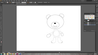
Below I have shown the design process of the character I will be using for my Help In Hand Campaign. I wanted a social but at the same time character that everyone would love and can relate to. I also think seeing a teddy bear in a poster or display in public would make a person look at what the display is about. 

The goal of my campaign is not for us to change our attitudes and behaviour towards travellers with buggies or help just today but for the future to come. For instance if a chid today sees the poster and ask his parent what it is, then this can be something this child carries on to the future generation of adults.

I used two software's to design my character; Illustrator for making the shapes and slight colouring and Photoshop for the finishing touch.


Tuesday, 15 January 2013

Mr Brainwash (Task 6)


My trip to Mr Brainwash !!! I enjoyed this exhibition very much because of the style and approach he takes towards design.  To me, his exhibition stands out more than many other within the urban art world. I've seen a few other Urban design styles. They are nice but I think the way  Mr Brainwash was presented, make his work that much better.


I am a big music fan and the next 3 pictures are some of the ones I really liked. As being a promoter and designer myself the concept of taking the records and designing the artist/s from them is outstanding. The idea of using the old vinyl records as part of the portrait is unique, especially vinyl not being used anymore these days and these portraits are mostly a collective presentation of artists from the past. This adds novelty value to his work.


As a kid growing up Mickey Mouse was a cartoon we grew up with and for him to blend Charlie Chaplin with mickey is something not many people are designer would decide to try and do. I get his concept behind it which is both of them are icons to many.  A presentation of a the same era. 


What I enjoyed most about going to see this exhibition is that it was with my classmates which is my new found friends which has given me inspiration in my course so far.

Experiment (Pt 2 and 3)

Here I have experimented with the logo on T-Shirts and Pin Badge. I have also put my Character in some live scenes.  


Pin Badge 


T-Shirt Source: (Google) and my own