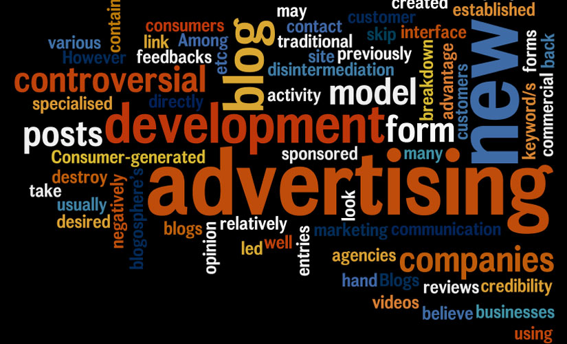
The marketing role The communication role The economic role The societal role
A marketing role within advertising will focus on satisfying general consumers and seeing to their requirements through services and goods. It will not be directed at all the public but only at certain customers that are termed a ‘target market’.
A communication role in advertising will refer to a mass communication intention that advertising will be capable of fulfilling. This is an impressive way in which to inform customers and let them know about the services and goods they wish to buy.
With regards to an economical role in advertising, this will directly deal with the objectives of the advertiser. Normally, the objectives of an advertiser are to be able to generate sales from an advertisement. It will also help a consumer to appraise both the value as well as the benefits of any of the products which are advertised against their prices that the products are being offered at so as to make the most economic and efficient choice.
Finally, a societal role within advertising is quite a fascinating role. On the one hand, an advertisement will help to generate the trends within a certain society. In contrast, it is the cause of breaking a norm that has been a part of society for a while so as to generate a truly unique impact. It tends to have a somewhat tentative nature, which some people will like while some will resent it.
Just about any medium could be utilized for advertising. Commercial advertising can include billboards, wall paintings, web banners, television adverts, subway trains and platforms amongst others. There is also digital advertising as in television, radio and online advertising. Physical advertising could include mobile billboard, in-store, street and press advertising.
While doing my research on sustainable design , I came across this website (http://www.popsci.com) There were a few others but not as detailed and also had a plan from today leading up to 2030. They estimated by 2030 there will be 5 billion people living in urban area compare to the 3.3 today. The monster infrastructure already roaring to life in Asia and Africa. Such growth poses profound ecological problems, but at thier best, cities are actually the easiest places for eco-minded living.
This company has presented the most visionary ideas put forth by scientists, engineers and designers to mate the cities ofr the future what they were meant to be all along: sustainable.
I think their plans are very realistic why? Because most of the new sustainable designs we see today was mocked up for movies like Back to the Future with Jamie Fox. The thing is designs was never made to work just for our mind to wonder, but with how the world is changing today for the bad scientist and designers came together and made most of them possible and there is more to come just like what Popsci have planed.
PodCar
Electric Car Today
SkyTran
Electric Power
Green House
The Wall Street Journal asked four architects to:
design an energy-efficient, environmentally sustainable house without regard to cost, technology, aesthetics or the way we are used to living. The idea was not to dream up anything impossible or unlikely -- in other words, no antigravity living rooms. Instead, we asked the architects to think of what technology might make possible in the next few decades. They in turn asked us to rethink the way we live.
The results are fascinating. Where some might say that the green gizmo-covered single family house in Greenwich is over, this is the Wall Street Journal, and hey, they all have their old salaries back, the boys are back in town, so whatever, there's no need to really rethink the way we live.
William McDonough + Partners envisions its house like a tree. The "bark" of the house is made up of thin, insulating films that would self-clean and self-heal if damaged. A curved roof with large eaves provides shade, which lowers the heat load in summer. The "trunk," or the frame of the home, consists of carbon tubes, while the "roots" are a heat-pump system buried in the yard.
I have done 3 different examples of letterhead for this project. The one above I have add two extra thumbprint why? When we hold a paper or something to read our thumb is always the finger that faces up and the finger we use to hold firmly onto a object. So what I have done with this letterhead is put the thumbs at the main area where we would hold to read.
I did some research on the best designed business card to get some idea for where I should start. I really like that cards that I have added above but decided to go for a more plan and simple look but yet still professorial.
Experiments
I have always like the look of plastic business card. So I looked into getting some design and how I would go about it. Below are two templates that was sent from a company I contacted to look into getting them done. Each of the companies have their own template and strict requirements because the printer proses has to be done properly so none of the material are wasted.
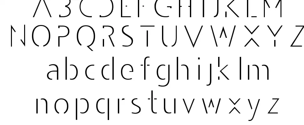
Here are the fonts I have selected to experiment with for my final typeface to use on my logo. The name Thumbson Media will be my company's name therefore the font has to be very clear and visible. The font I decided to use is Amerika Sans serif will be the official font for the words in the Thumbson, Created
by Apostrophic Labs.
Like I mention above I have chosen the name Thumbson Media and the typeface Amerika sans, I can started my testing. Because I will be using the word (Thumb) in my logo I decided to use a thumbprint for my branding. please view the sample below.
I have decided to use the font family Andarilho Font Normal for the word (Media) The font has an
incomplete look to it that makes it stand out in a Hip, modern and stylish way
Logo Testing
Stage 1
Stage 2
After receiving some feedback my journey began and I went deeper into my brain to come up with that master peace.
Stage 3
Stage 4
I have narrow down my selections from stage 2 and the above logos is what I will be working on.
(1) Public or private sector, domestic or international, organizations that propose, develop, establish, monitor, and/or coordinate voluntary standards. Examples are American National Standards Institute (ANSI), European Union Standards Organization, and International Standards Organization (ISO)
Packagingis the science, art, and technology of enclosing or protecting products for distribution, storage, sale, and use. Packaging also refers to the process of design, evaluation, and production of packages. Packaging can be described as a coordinated system of preparing goods for transport, warehousing, logistics, sale, and end use. Packaging contains, protects, preserves, transports, informs, and sells. In many countries it is fully integrated into government, business, institutional, industrial, and personal use.
Package labeling (American English) or labelling (British English) is any written, electronic, or graphic communications on the packaging or on a separate but associated label.
Bad Packaging !!
Good Packaging
6 Rule For Packaging
1. Clarity and simplicity
Next time you go to a supermarket, pick a random shelf and browse through some products. Glance at each and ask yourself two very simple questions:
What’s this product for?
What’s the brand behind it?
2. Honesty
Beginners in packaging design, and I’m talking both clients and designers, often strive to depict the product in the most perfect way imaginable. They will show a cookie drenched in chocolate, when in fact you’re buying a simple chocolate flavored biscuit. They’ll show rich, fresh cherries on fruit yogurt with little fruit content.
By depicting a product ten times better than it actually is, you’re misleading and ultimately disappointing the consumer, which only leads to poor sales performance and very bad brand image.
3. Authenticity
Originality, character and memorability are at the heart of great brands and of course, great packaging designs.
It’s easy to understand why – there are hundreds of products out there, all competing for consumers’ attention. The only way to set your brand apart is to be different, to be authentic.
Because this is truly a matter of creativity and exploration, it’s impossible to give advice on how to “be authentic,”especially nowadays when people are faced with myriad of brands, looks and appeals.
4. Shelf impact
From a shopper’s point of view, a product is never seen alone and never in great detail. Because of the viewing distance from shelves and the fact that products are arranged in rows and columns, all we see are veritable patterns made of various products. It’s not until a certain pattern attracts our attention that we decide to take a closer look.
This distinctiveness and appeal of the product when placed on an actual shelf is something retailers call “shelf impact,” and it makes a huge difference in product sales.
5. Extensibility
A product packaging design concept should allow for an easy introduction of a new line extension (product variation) or a sub-brand.
For example, imagine you’re creating a packaging for new brand of apple juice. You and your client opt for a certain design featuring apples which looks really great. However, a few months later, the client decides to launch a cherry flavor under the same brand name.
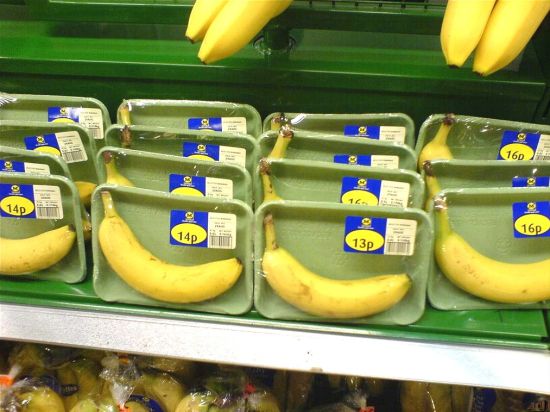
6. Practicality
Practicality deals with the actual shape, size and functionality of the product container, not just the label or wrap. The more practical the product, the more sales it gets – when Heinz turned the ketchup bottle upside down, sales skyrocketed.
Roy Lichtenstein: American Pop artist; painter, lithographer and sculptor. Born in New York. Studied at the Art Students League 1939, and at Ohio State College 1940-3. War service 1943-6. Returned to Ohio State College 1946-9, and taught there until 1951. First one-man exhibition at the Carlebach Gallery, New York, 1951. Lived in Cleveland, Ohio 1951-7, painting and making a living at various odd jobs. Instructor at New York State University, Oswego, New York 1957-60, and at Rutgers University 1960-3. Painted in a non-figurative and Abstract Expressionist style 1957-61, but began latterly to incorporate loosely handled cartoon images, Mickey Mouse, Donald Duck etc., in his paintings. Made a breakthrough into his characteristic work in 1961; painted pictures based on comic strip images, advertising imagery and overt adaptations of works of art by others, followed by classical ruins, paintings of canvas backs or stretchers, etc. Made land, sea, sky and moonscapes in 1964, sometimes in relief and incorporating plastics and enamelled metal. His later work includes some sculptures, mostly in polished brass, based on Art-Deco forms of the 1930s, etc. Lives in New York.
'Whaam!' is based on an image from 'All American Men of War' published by DC comics in 1962. Throughout the 1960s, Lichtenstein frequently drew on commercial art sources such as comic images or advertisements, attracted by the way highly emotional subject matter could be depicted using detached techniques. Transferring this to a painting context, Lichtenstein could present powerfully charged scenes in an impersonal manner, leaving the viewer to decipher meanings for themselves. Although he was careful to retain the character of his source, Lichtenstein also explored the formal qualities of commercial imagery and techniques
Interior with Waterlilies: This work is one of a series of paintings Lichtenstein made in the early 1990s depicting domestic interiors. Painted on a very large scale, they were inspired by a billboard advertisement for a furniture store Lichtenstein had seen outside Rome in 1989. Lichtenstein, a leading figure of American Pop art, is best known for his 1960s paintings derived from comic strip panels, such as Whaam! 1963 (Tate T00897). Throughout his career he continued to base his paintings on imagery from popular culture and the mass media. He sourced the images for this painting, as for others in his Interiors series, from advertisements found in the Yellow Pages.
Sandwich and Soda;In the 1960s there was a deliberate attempt by artists and print publishers to reach a bigger audience for art through the production of prints that were released in large editions. This objective was facilitated by screenprinting, a process which yielded many more examples than the more traditional printmaking methods of engraving or lithography. This print is from a portfolio entitled 'X + X(Ten Works by Ten Painters)' which was produced in an edition of 500 prints in 1964. Printed on plastic, this is one of Lichtenstein's first Pop prints, and the first to be made on a surface other than paper
Reflections on Brushstrokes: This print is from a group of seven Reflections prints which Lichtenstein completed at Tyler Graphics in 1989-90, another of which also appears in Tate’s collection (Reflections on Hair 1990, Tate P12127). The image is partly obscured by semi-abstract blocks of colour and pattern, both printed and collaged to the surface of the print, which simulate reflected light, as if the image shown is behind glass or reflected in another surface. This simulated reflection is a conceit Lichtenstein developed in a series of Reflections paintings he started in 1988, but has a precedent in earlier works.
Haystacks 1–7 1969: In 1968–9 Lichtenstein made a series of paintings paraphrasing Claude Monet's ‘Haystacks’ and ‘Rouen Cathedral’ paintings (1891 and 94). He made prints on this theme at Gemini in 1969: the series of seven ‘Haystacks’ runs from morning (yellow) to midnight (black, with embossing) in a mechanical version of Monet's changing light effects.
Paul Rand: (August 15, 1914 – November 26, 1996) was an Americangraphic designer, best known for his corporatelogodesigns, including the logos forIBM,UPS,Enron,Westinghouse,ABC, andSteve Jobs'sNeXT. He was one of the originators of theSwiss Styleof graphic design.
Rand was educated at the Pratt Institute (1929–1932), Parsons The New School for Design (1932–33), and the Art Students League(1933–1934). From 1956 to 1969, and beginning again in 1974, Rand taught design at Yale University in New Haven, Connecticut. Rand was inducted into the New York Art Directors Club Hall of Fame in 1972.
Some Work
IBM
Im off the Storm
Paul Rand Interview
Paul Rand book - brian yohn design
Early career
His career began with humble assignments, starting with a part-time position creating stock images for a syndicate that supplied graphics to various newspapers and magazines. Between his class assignments and his work, Rand was able to amass a fairly large portfolio, largely influenced by the German advertising style Sachplakat (ornamental poster) as well as the works of Gustav Jensen. It was at around this time that he decided to camouflage (and abbreviate) the overtly Jewish identity telegraphed by ‘Peretz Rosenbaum,’ shortening his forename to ‘Paul’ and taking ‘Rand’ from an uncle to form his new surname. Morris Wyszogrod, a friend and associate of Rand, noted that “he figured that ‘Paul Rand,’ four letters here, four letters there, would create a nice symbol. So he became Paul Rand.” Peter Behrens notes the importance of this new title: “Rand’s new persona, which served as the brand name for his many accomplishments, was the first corporate identity he created, and it may also eventually prove to be the most enduring.” Indeed, Rand was rapidly moving into the forefront of his profession. In his early twenties he was producing work that began to garner international acclaim, notably his designs on the covers of Direction magazine, which Rand produced for no fee in exchange for full artistic freedom. Among the accolades Rand received were those of Moholy-Nagy:
Corporate identities
Indisputably, Rand’s most widely known contribution to graphic design are his corporate identities, many of which are still in use. IBM, ABC, Cummins Engine, Westinghouse, and UPS, among many others, owe their graphical heritage to him, though UPS recently carried out a controversial update to the classic Rand design. One of his primary strengths, as Maholy-Nagy pointed out, was his ability as a salesman to explain the needs his identities would address for the corporation. According to graphic designer Louis Danziger:
Influences and other works
Development of theory
Though Rand was a recluse in his creative process, doing the vast majority of the design load despite having a large staff at varying points in his career, he was very interested in producing books of theory to illuminate his philosophies. Maholy-Nagy may have incited Rand’s zeal for knowledge when he asked his colleague if he read art criticism at their first meeting. Rand said no, prompting Moholy-Nagy to reply “Pity.” Heller elaborates on this meeting’s impact, noting that, “from that moment on, Rand devoured books by the leading philosophers on art, including Roger Fry, Alfred North Whitehead, and John Dewey.” These theoreticians would have a lasting impression on Rand’s work; in a 1995 interview with Michael Kroeger discussing, among other topics, the importance of Dewey’s Art as Experience, Rand elaborates on Dewey’s appeal:
Criticism
Despite the prestige graphic designers place on his first book, subsequent works, notably From Lascaux to Brooklyn (1996), earned Rand accusations of being “reactionary and hostile to new ideas about design.” Heller defends Rand’s later ideas, calling the designer “an enemy of mediocrity, a radical modernist” while Mark Favermann considers the period one of “a reactionary, angry old man.” Regardless of this dispute, Rand’s contribution to modern graphic design theory in total is widely considered intrinsic to the profession’s development.