Pages

Wednesday 27 March 2013

Task 8 (2013)

Sustainable design


While doing my research on sustainable design , I came across this website (http://www.popsci.com) There were a few others but not as detailed and also had a plan from today leading up to 2030. They estimated by 2030 there will be 5 billion people living in urban area compare to the 3.3 today. The monster infrastructure already roaring to life in Asia and Africa. Such growth poses profound ecological problems, but at thier best, cities are actually the easiest places for eco-minded living.

This company has presented the most visionary ideas put forth by scientists, engineers and designers to mate the cities ofr the future what they were meant to be all along: sustainable.

I think their plans are very realistic why? Because most of the new sustainable designs we see today was mocked up for movies like Back to the Future with Jamie Fox. The thing is designs was never made to work just for our mind to wonder, but with how the world is changing today for the bad scientist and designers came together and made most of them possible and there is more to come just like what Popsci have planed.


PodCar 
Electric Car Today
SkyTran
Electric Power

Green House 

The Wall Street Journal asked four architects to:
design an energy-efficient, environmentally sustainable house without regard to cost, technology, aesthetics or the way we are used to living. The idea was not to dream up anything impossible or unlikely -- in other words, no antigravity living rooms. Instead, we asked the architects to think of what technology might make possible in the next few decades. They in turn asked us to rethink the way we live.
The results are fascinating. Where some might say that the green gizmo-covered single family house in Greenwich is over, this is the Wall Street Journal, and hey, they all have their old salaries back, the boys are back in town, so whatever, there's no need to really rethink the way we live.
William McDonough + Partners envisions its house like a tree. The "bark" of the house is made up of thin, insulating films that would self-clean and self-heal if damaged. A curved roof with large eaves provides shade, which lowers the heat load in summer. The "trunk," or the frame of the home, consists of carbon tubes, while the "roots" are a heat-pump system buried in the yard.


Source: www.treehugger.com , www.popsci.com , www.google.com

Wednesday 13 March 2013

Business For Design (Letterhead)

Letterhead


I have done 3 different examples of letterhead for this project. The one above I have add two extra thumbprint why? When we hold a paper or something to read our thumb is always the finger that faces up and the finger we use to hold firmly onto a object. So what I have done with this letterhead is put the thumbs at the main area where we would hold to read.

Business For Design (Business Card)

Business Card Testing 


I did some research on the best designed business card to get some idea for where I should start. I really like that cards that I have added above but decided to go for a more plan and simple look but yet still professorial.   


Experiments


I have always like the look of plastic business card. So I looked into getting some design and how I would go about it. Below are two templates that was sent from a company I contacted to look into getting them done. Each of the companies have their own template and strict requirements because the printer proses has to be done properly so none of the material are wasted.  


Business for Design (Fonts and Logo)

Font Testing 


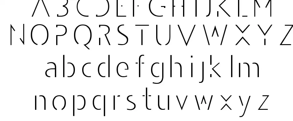
Here are the fonts I have selected to experiment with for my final typeface to use on my logo. The name Thumbson Media will be my company's name therefore the font has to be very clear and visible. The font I decided to use is Amerika Sans serif will be the official font for the words in the Thumbson, Created by Apostrophic Labs. 


Like I mention above I have chosen the name Thumbson Media and the typeface Amerika sans, I can started my testing. Because I will be using the word (Thumb) in my logo I decided to use a thumbprint for my branding. please view the sample below. 

I have decided to use the font family Andarilho Font Normal for the word (Media) The font has an incomplete look to it that makes it stand out in a Hip, modern and stylish way


Logo Testing

Stage 1

Stage 2

After receiving some feedback my journey began and I went deeper into my brain to come up with that master peace.


Stage 3


Stage 4

I have narrow down my selections from stage 2 and the above logos is what I will be working on. 


Thursday 7 March 2013

Task 6 (2013)

Packaging 


What is Packaging??


(1) Public or private sectordomestic or international, organizations that proposedevelopestablishmonitor, and/or coordinate voluntary standards. Examples are American National Standards Institute (ANSI)European Union Standards Organization, and International Standards Organization (ISO)


Packaging is the science, art, and technology of enclosing or protecting products for distribution, storage, sale, and use. Packaging also refers to the process of design, evaluation, and production of packages. Packaging can be described as a coordinated system of preparing goods for transport, warehousing, logistics, sale, and end use. Packaging contains, protects, preserves, transports, informs, and sells. In many countries it is fully integrated into government, business, institutional, industrial, and personal use.
Package labeling (American English) or labelling (British English) is any written, electronic, or graphic communications on the packaging or on a separate but associated label.


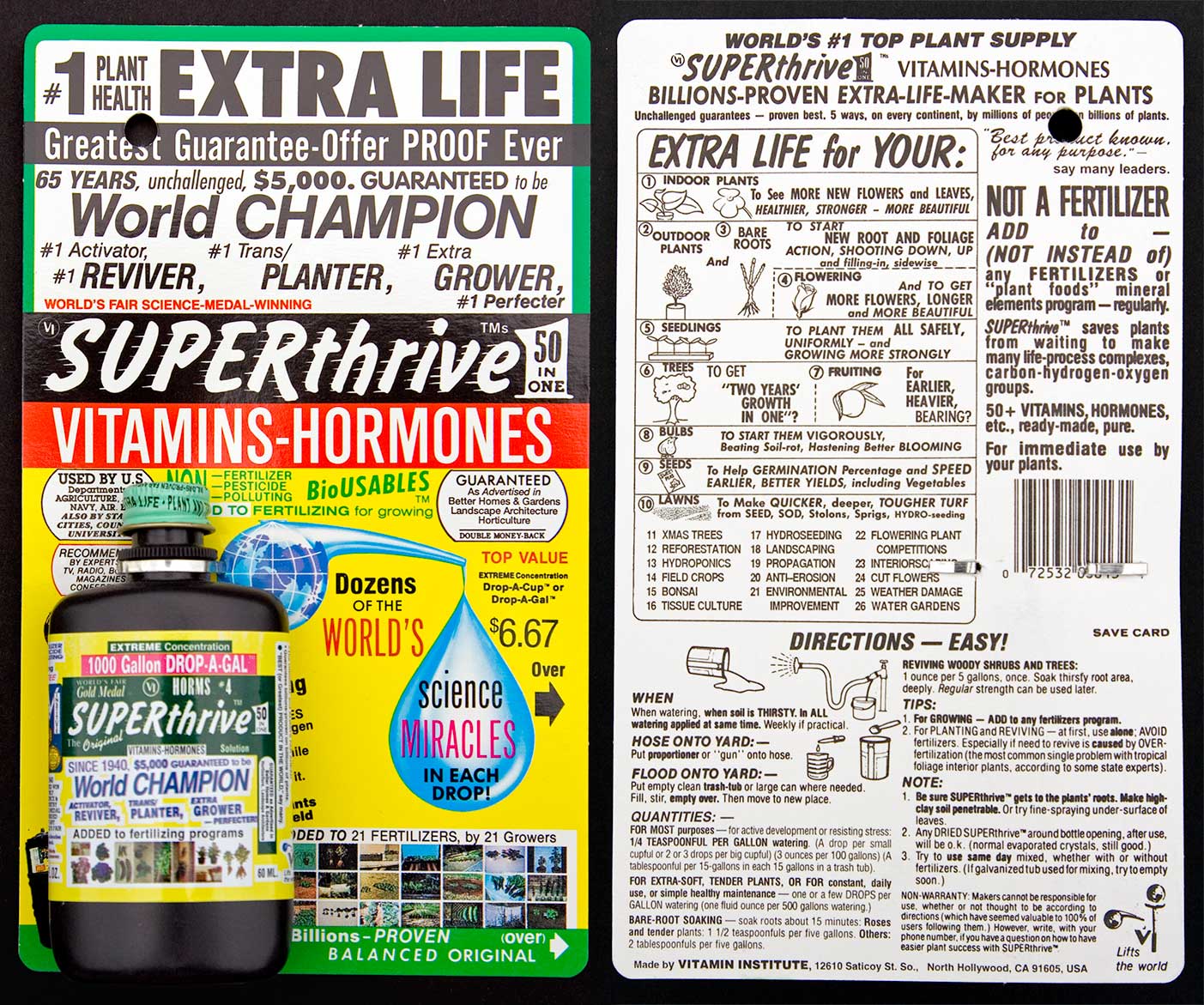
Bad Packaging !!


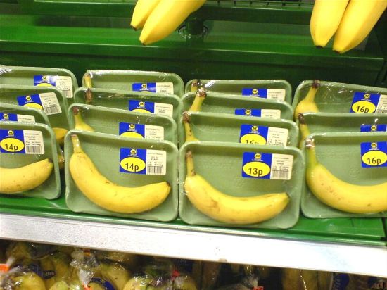
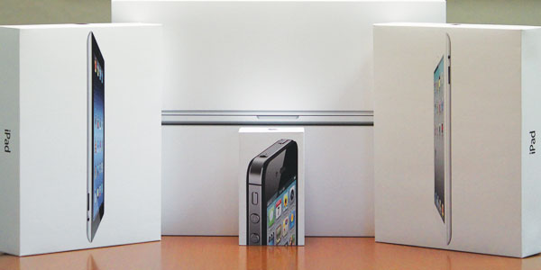
Good Packaging


6 Rule For Packaging 


1. Clarity and simplicity

Next time you go to a supermarket, pick a random shelf and browse through some products. Glance at each and ask yourself two very simple questions:
  1. What’s this product for?
  2. What’s the brand behind it?

2. Honesty

Beginners in packaging design, and I’m talking both clients and designers, often strive to depict the product in the most perfect way imaginable. They will show a cookie drenched in chocolate, when in fact you’re buying a simple chocolate flavored biscuit.  They’ll show rich, fresh cherries on fruit yogurt with little fruit content.
By depicting a product ten times better than it actually is, you’re misleading and ultimately disappointing the consumer, which only leads to poor sales performance and very bad brand image.


3. Authenticity

Originality, character and memorability are at the heart of great brands and of course, great packaging designs.
It’s easy to understand why – there are hundreds of products out there, all competing for consumers’ attention. The only way to set your brand apart is to be different, to be authentic.
Because this is truly a matter of creativity and exploration, it’s impossible to give advice on how to “be authentic,”especially nowadays when people are faced with myriad of brands, looks and appeals.

4. Shelf impact

From a shopper’s point of view, a product is never seen alone and never in great detail. Because of the viewing distance from shelves and the fact that products are arranged in rows and columns, all we see are veritable patterns made of various products. It’s not until a certain pattern attracts our attention that we decide to take a closer look.
This distinctiveness and appeal of the product when placed on an actual shelf is something retailers call “shelf impact,” and it makes a huge difference in product sales.

5. Extensibility

A product packaging design concept should allow for an easy introduction of a new line extension (product variation) or a sub-brand.
For example, imagine you’re creating a packaging for new brand of apple juice. You and your client opt for a certain design featuring apples which looks really great. However, a few months later, the client decides to launch a cherry flavor under the same brand name.

6. Practicality

Practicality deals with the actual shape, size and functionality of the product container, not just the label or wrap. The more practical the product, the more sales it gets – when Heinz turned the ketchup bottle upside down, sales skyrocketed.


Source: http://99designs.com/designer-blog/2012/07/25/6-rules-of-great-packaging-design/
www.goolge.com
www.wikipedia.com